Creating a Consulting Landing Page That Turns Visitors Into Clients
Jan 10, 2025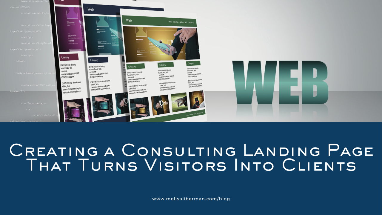
Estimated Reading Time: 44 minutes
Download the article as a PDF:

Table of contents
- What is a consulting landing page?
- Understanding the use cases for consulting landing pages
- 10 essential elements of an effective landing page for showcasing your consulting services
- 3 consulting landing page examples to draw inspiration from
- Best tools to use for creating your consulting landing page
- Common mistakes to avoid when creating a consulting landing page
- Frequently asked questions about consulting landing pages
- From building an effective landing page to growing your independent consulting business: Your next steps
What is a consulting landing page?
A consulting landing page is a focused, single-page website designed to legitimize your business, convert visitors into your sales funnel—starting with your email list—and position you as an expert in your space.
Its primary purpose is to drive lead generation by showcasing your expertise and using action-oriented messaging to guide potential clients toward specific actions, such as scheduling a call or signing up for services. With a clean and strategic design, a consulting landing page helps you, an independent consultant, stand out and grow your business effectively.
What is the difference between a consulting website and a consulting landing page?
The key difference between a consulting website and a consulting landing page lies in structure and purpose. A consulting website is typically a multi-page platform that provides comprehensive information about your business, services, experience, and background, catering to a wide range of visitor interests.
In contrast, a consulting landing page is a single-page design with a laser focus on one goal: converting visitors into leads. With simplified navigation and a clear, action-oriented call-to-action (CTA) strategy, landing pages minimize distractions and guide potential clients toward a specific outcome, such as subscribing to your email list or booking a consultation. This streamlined approach makes landing pages a powerful tool for lead conversion and client engagement.
Understanding the use cases for consulting landing pages
For B2B independent consultants, landing pages can be an essential tool for addressing specific business objectives. Whether you're showcasing a productized service, generating leads from decision-makers, or driving registrations for a corporate webinar, these focused pages enable you to connect directly with your ideal audience.
By tailoring each landing page to a clear purpose and emphasizing results-driven messaging, you can effectively demonstrate your expertise and guide potential clients toward meaningful action.
Use case 1: Landing pages serving as a single-page website for your consulting business and services
For independent B2B consultants, a landing page can double as an all-in-one website to present your consulting business and services. This streamlined approach offers a simplified user experience by consolidating key information—such as your expertise, service offerings, and client success stories—onto a single, well-organized page.
Using a landing page as your primary site is also an easy way to get started, especially if you’re not yet clear on your niche, ideal target client, value proposition, or messaging. It allows you to establish an online presence while refining these elements over time.
An all-in-one landing page is especially effective for showcasing your unique value proposition and expertise without overwhelming visitors with excessive navigation or content. By including concise yet compelling sections, such as a brief “About” section, a services overview, testimonials, and a clear call-to-action, your landing page becomes a powerful tool to attract and engage potential clients. It’s an efficient way to legitimize your business and provide decision-makers with the information they need to take the next step.
Use case 2: Landing pages promoting your lead magnets, products, or services
Landing pages are a powerful tool for promoting your lead magnets, digital products, and consulting services. Each of these requires a unique approach to maximize conversion rates and effectively target your audience.
Lead Magnet Optimization
A lead magnet is a free, high-value resource you offer to potential clients in exchange for their contact information, such as their name and email address. It is specifically designed to attract, engage, and convert landing page visitors into leads by addressing a pressing problem or need.
While a lead magnet may not have a monetary cost, it does require visitors to trust you enough to share their personal information. To earn this trust, your landing page must feature clear, compelling text that provides a strong reason for your ideal audience to exchange their information for the value you’re offering.
When promoting lead magnets like eBooks, assessments, checklists, or webinars, your landing page should focus on delivering clear value upfront to the specific audience you want to attract.
I recommend using ScoreApp (my affiliate link for 50% off your first month) as an all-in-one tool for your consulting lead magnets. You can build powerful assessments, quizzes, and scorecards that help your ideal potential clients find you and derive value from your expertise.
When building your lead magnet landing page, highlight how the resource you’re sharing addresses a specific pain point or helps solve a problem your audience faces. Use concise, benefit-driven copy, a visually appealing design, and a compelling call-to-action (CTA) to encourage visitors to submit their contact information.
An effective strategy for writing a landing page is to write to one person. Think of your most ideal client and then write to that person. Don’t try to make your landing page all things to all potential clients. The more specific, the more effective and higher converting it will be.
Landing Pages for Digital Products
If you offer digital products such as templates, toolkits, or online courses, your landing page should emphasize the outcomes buyers can achieve. Incorporate testimonials, detailed descriptions, and preview content to build trust and credibility. A conversion-focused design with an easy checkout process is essential for minimizing drop-offs and boosting sales.
Service-Specific Landing Pages
When showcasing your productized consulting services, you can create landing pages tailored to each service offering. For example, if you provide strategic planning and team-building workshops, each service would have its own dedicated page. This allows you to target specific keywords and speak directly to the unique needs of different audience segments. Include case studies, results, and CTAs that encourage visitors to book an initial consultation or discovery call.
Strategies to Maximize Your Landing Page Conversion
Here are two strategies to maximize the conversion rate on your landing pages.
Audience Targeting Strategies
A well-optimized landing page begins with a clear understanding of your target audience. Use audience insights to craft messaging and visuals that resonate with their priorities and pain points. Personalization can further enhance engagement, such as addressing industry-specific challenges or including client testimonials relevant to your visitor’s niche.
Conversion-Focused Design
A successful landing page combines strategic content with design elements that guide visitors toward your desired action. Use clean layouts, prominent CTAs, mobile responsiveness, and persuasive copy to create a seamless user experience. Incorporate trust signals like client logos, reviews, or guarantees to instill confidence in your offering.
By tailoring your landing pages to these use cases, you can drive more traffic, generate qualified leads, and convert visitors into paying clients effectively.
Use case 3: Integrating the Landing Page into a Full-Blown Website
When you’re ready to advance to a full-blown website, you can seamlessly integrate your original landing page into a more comprehensive website. This allows you to maintain the focus and effectiveness of your landing page while expanding its functionality to include additional resources, services, and client touchpoints.
Transitioning from a Single Landing Page:
Start by using your landing page as the foundation of your full-blown website. Your landing page’s original elements—such as the headline, call-to-action, and value proposition—can remain front and center as the homepage. From there, you can build out supporting pages, such as:
- A dedicated Services page with detailed descriptions and use cases.
- A Case Studies or Portfolio page to highlight in-depth client success stories.
- A Resources page offering blog posts, whitepapers, or downloadable lead magnets.
- A Contact page with additional options for inquiries or booking.
Preserving Landing Page Principles:
While expanding, ensure your website retains the streamlined, conversion-focused elements of the original landing page. For example:
- Keep the primary call-to-action (e.g., “Schedule a Consultation” or “Download the Assessment”) visible on every page.
- Ensure the design remains clean and uncluttered to avoid overwhelming visitors.
- Optimize each page for specific goals, such as lead generation, showcasing expertise, or nurturing existing clients.
Enhancing User Experience:
By integrating the landing page into a full-blown website, you can provide a more robust experience for corporate decision-makers and potential clients. For instance:
- Add navigation menus to make it easy for visitors to explore additional content.
- Include SEO-optimized content to attract more organic traffic from search engines.
- Incorporate interactive features such as scheduling tools, chatbots, or assessments.
Example Integration Approach:
- Landing Page (Homepage): Keep the core sections—value proposition, key benefits, testimonials, and a single CTA—intact to ensure first-time visitors quickly understand your expertise.
- Expanded Pages: Link to new pages like “Meet the Team,” “Industries Served,” or “Success Stories” to deepen trust and engagement with visitors seeking more information.
By thoughtfully integrating your landing page into a broader website, you preserve its original strengths while providing a more comprehensive platform for engaging and converting corporate clients. This evolution supports your business’s growth and positions your website as a scalable, professional digital presence.
10 essential elements of an effective landing page for showcasing your consulting services

There are ten must-have elements that make your consulting service landing page more effective as a lead generation tool. Whether it’s crafting an attention-grabbing headline, showcasing proof of your expertise, or creating an irresistible call-to-action, these tips will help you design a page that captivates your ideal consulting clients. Learn how to stand out, build trust, and turn visitors into loyal clients with these ten components.
1. Clear and compelling headline
Your headline is the first thing visitors see, making it the most critical element of your landing page. A clear and compelling headline grabs attention immediately, communicates the core value of your consulting services, and encourages the visitor to stay and explore further.
What to Do:
- Headline Structure: Keep it concise, straightforward, and focused on your audience’s needs. For example, “Double Your Start-Up Operation Team’s Performance with 3 Proven Scaling Strategies” clearly communicates value and relevance.
- Messaging Clarity: Avoid jargon or vague language. Use simple, easy-to-understand words that convey your offering directly and effectively.
- Value-Focused Language: Highlight the primary benefit or outcome your consulting services provide, such as “Streamline 5 Key Operational Processes to Save Time and Cut Costs.”
- Action-Driven Phrasing: Use verbs like "Achieve," "Transform," or "Master" to inspire action and urgency.
- Client-Centered Statements: Focus on your client’s challenges, goals, or aspirations, making it clear how you’ll help them. For example, "Evaluate Your Marketing Strategy: Discover Key Gaps and Opportunities to Drive ROI in Just 5 Minutes"
What Not to Do:
- Overly Generic Headlines: Avoid headlines like “Expert Consulting Services” that fail to differentiate your offering or communicate value.
- Jargon-Heavy Language: Don’t use technical terms or industry buzzwords that may confuse or alienate your audience.
- Self-Focused Messaging: Headlines centered on you or your business, like “We’ve Been Industry Leaders for 20 Years,” are less engaging than client-focused language.
- Too Long or Wordy: Lengthy headlines can overwhelm visitors and dilute your core message. Keep it short and impactful.
- Overpromising or Vague Claims: Avoid making exaggerated promises like “Guaranteed Success” unless you can back them up with specific results or evidence.
A clear and compelling headline not only captures attention but sets the tone for the rest of your landing page. By avoiding common pitfalls and focusing on clarity, value, and action, you can create a headline that motivates visitors to take the next step.
2. Engaging subheadline
Next, write a subheadline for your landing page. A subheadline builds on the promise of your headline and provides additional context and/or detail. It works as a bridge, guiding visitors from their initial interest to exploring the rest of your landing page.
What to Do:
- Clarify the Value: Use the subheadline to expand on the headline by explaining the specific benefits or outcomes your visitor can expect. For example, “Uncover actionable insights to optimize your client success strategy and achieve measurable results.”
- Address Pain Points: Speak directly to your audience’s challenges or goals. For a CMO taking an assessment, a subheadline like “Identify weaknesses diluting your marketing ROI and gain tailored recommendations for improvement” resonates with their needs.
- Keep It Concise: Aim for one or two sentences that reinforce the core message without overwhelming the visitor with too much information.
- Incorporate Keywords: Include relevant terms your audience may be searching for, like "marketing strategy," "performance insights," or "ROI analysis."
What Not to Do:
- Repetition: Avoid restating the headline word-for-word. The subheadline should add new value or context.
- Too Vague or General: A generic statement like “Get helpful tips” doesn’t clearly explain why the visitor should engage further.
- Overloading with Details: Don’t pack too much information into the subheadline. Save specifics for later sections of the page.
- Irrelevant Messaging: Ensure the subheadline directly supports the headline and doesn’t introduce unrelated concepts that distract from the main message.
Example Subheadline for CMOs:
“Pinpoint the strengths and weaknesses of your marketing strategy and unlock data-driven recommendations to maximize your team’s performance and ROI.”
By crafting a subheadline that reinforces your headline and aligns with your audience’s needs, you create a smooth transition that keeps visitors engaged and encourages them to take action.
3. Hero Image or Video
Your hero image or video is the visual centerpiece of your landing page, designed to grab attention and create an emotional connection with your audience. It should instantly convey your brand’s identity, the value of your consulting services, and the promise of transformation for your ideal clients.
What to Do:
- Visual Storytelling: Use imagery or video that tells a story about your services or highlights the outcome your clients can expect. For example, a dynamic video of a team collaborating effectively after a successful marketing strategy overhaul can resonate with CMOs.
- Impactful Consulting Imagery: Choose visuals that reflect your positioning, messaging, and expertise. For instance, for start-up COOs, an image of a streamlined, tech-driven operation can evoke a sense of control and growth.
- Brand Identity in Visuals: Ensure the colors, style, and tone of the visuals align with your consulting brand. If your tone is innovative and cutting-edge, opt for sleek, modern design elements.
- Conversion-Focused Hero Design: Position the image or video strategically alongside your headline and call-to-action (CTA) to guide the visitor's focus and encourage engagement.
- Emotional Connection Through Visuals: Select visuals that evoke feelings of success, relief, or confidence. For CMOs, this might be imagery of campaign dashboards showing high ROI. For start-up COOs, a hero video showcasing the transformation from chaos to efficiency can be compelling.
What Not to Do:
- Generic Stock Images: Avoid overused, irrelevant visuals like generic handshake photos or random office environments that don’t connect with your audience.
- Cluttered Designs: Too many elements in your hero section can overwhelm visitors. Keep it clean and focused.
- Unrelated Visuals: Ensure the image or video aligns with the message and promise of your headline and subheadline.
- Low-Quality Media: Poor resolution or unprofessional visuals can damage credibility and trust.
By leveraging high-quality, brand-aligned visuals in your hero section, you can captivate your audience, build trust, and set the stage for conversions.
4. Strong call-to-action (CTA)
A strong call-to-action (CTA) is the driving force behind converting visitors into leads or clients on your landing page. Your CTA should be clear, action-oriented, and compelling, guiding visitors toward the next step with minimal friction.
What to Do:
- Use Action-Oriented Language: CTAs like “Take the Assessment,” “Get Your Free Guide,” or “Schedule a Strategy Call” motivate visitors to act by clearly stating what they will gain. Avoid passive language like “Learn More” unless paired with a benefit.
- Effective Placement of CTAs: Position your primary CTA prominently above the fold and repeat it strategically throughout the page, especially after key sections like testimonials or benefit highlights. For example, place one CTA immediately after showcasing the value of your services and another at the bottom for visitors who scroll further.
- Encourage Immediate Response: Create urgency by using phrases like “Start Now” to nudge visitors toward taking action without hesitation.
- Clarity in Desired Actions: Be specific about what happens next. For example, “Take the 5-Minute Marketing Assessment to Discover Gaps in Your Strategy” sets clear expectations and adds value to the action.
- A/B Testing CTAs: Test different CTA styles, wording, and button designs to determine what resonates best with your audience. For instance, experiment with “Get Started” versus “Start Your Free Assessment” or test button colors and sizes.
What Not to Do:
- Vague or Generic CTAs: Avoid unclear phrases like “Click Here” or “Submit” that fail to explain the value or desired outcome.
- Overloading with Multiple CTAs: Too many CTAs with different actions can confuse visitors. Stick to one clear objective per landing page.
- Hidden or Hard-to-Find CTAs: Ensure your CTA is prominent, easy to locate, and visually distinct from the rest of the page.
- Weak or Unmotivating Language: Avoid CTAs like “Contact Us” unless paired with an immediate benefit, such as “Contact Us to Unlock Growth Opportunities.”
Here are a couple of examples for you.
If your ideal client is a CMO, the CTA could be:
- “Take the 5-Minute Marketing Assessment and Uncover ROI-Boosting Opportunities.”
- “Schedule Your Free Strategy Session to Optimize Campaign Performance.”
If your ideal client is a Start-up COOs, the CTA could be:
- “Find Out How to Streamline Your Operations with Our Free Efficiency Scorecard.”
- “Book A Strategy Call to Develop Your One-Page Scaling Plan.”
By crafting clear, visually appealing, and strategically placed CTAs, you can effectively guide visitors to take immediate, purposeful action, driving more leads and conversions from your landing page.
5. Benefits and services overview
This section should clearly outline the benefits and value of completing the assessment while tying it directly to the consulting services you offer. It needs to focus on how the results will address the visitor’s pain points and provide actionable insights that align with your expertise.
What to Do:
- Highlight What They’ll Gain from the Lead Magnet such as an Assessment: Explain the specific benefits of completing the assessment, such as uncovering gaps, identifying opportunities, or gaining clarity on next steps. For example:
- Example for a CMO audience: “Discover untapped opportunities to optimize your marketing campaigns and boost ROI.”
- Example for a Start-up COO audience: “Pinpoint inefficiencies in your operations and receive tailored strategies to scale effectively.”
- Tie the Results to Your Consulting Services: Position the assessment as the first step in a larger solution. For example: “The insights from this assessment are the foundation for building a custom strategy roadmap to achieve your business unit goals.”
- Use Benefit-Focused Language: Focus on outcomes visitors care about, like improved performance, better decision-making, or faster growth. For example: “Gain actionable recommendations to reduce operational bottlenecks and drive sustainable results.”
- Make It Quick and Easy to Understand: Use bullet points or icons to summarize the key benefits, such as:
- Immediate insights tailored to your business.
- A clear action plan for overcoming your biggest challenges.
- Expert recommendations aligned with your goals.
- Incorporate Visual Elements: Use icons or infographics to represent the benefits and make the section visually appealing. For example, a flowchart showing the process from assessment to strategy implementation.
What Not to Do:
- Overloading with Details: Don’t describe your full suite of consulting services here—focus on what they gain specifically from the assessment.
- Generic Claims: Avoid vague promises like “Improve your business” without explaining how the assessment leads to measurable outcomes.
- Unclear Connection to Your Services: Don’t treat the assessment as a standalone tool. Tie it to your consulting expertise and next steps.
- Text-Heavy Design: Break up the content with visuals or formatting to keep it engaging and scannable.
This benefit-focused section sets clear expectations, connects the assessment to your expertise, and builds excitement about the actionable value visitors will receive by completing it.
6. Social proof
Social proof builds trust and credibility by showing potential clients that others have achieved success with your services. Including compelling testimonials, case studies, or recognizable logos demonstrates the tangible impact of your expertise and encourages visitors to engage with your offering.
What to Do:
- Client Testimonials: Include short, impactful quotes from past clients that highlight specific results they achieved. For example:
- Example CMO Testimonial: “After completing the assessment, we uncovered a critical gap in our campaigns and increased ROI by 15% within three months.”
- Example start-up COO Testimonial: “This assessment helped us uncover 2 specific opportunities to streamline our operations, saving us over 10 hours per week in inefficiencies.”
- Case Studies as Evidence: Briefly summarize a success story that aligns with the audience’s pain points. Highlight the client’s problem, the action you took, and the measurable results. Link to a detailed case study if applicable.
- Recognized Client Logos: Showcase the logos of reputable companies or industries you’ve worked with to enhance your credibility. Use a headline like, “Trusted by Industry Leaders,” above the logos.
- Quantifiable Results: Use specific numbers or metrics to demonstrate the value of your work. For example: “Clients who’ve taken our assessment and followed our recommendations saw a 11% improvement in operational efficiency.”
- Video Testimonials for Impact: If possible, include short video testimonials from clients. Seeing and hearing real people share their experiences can create a stronger emotional connection and increase trust.
What Not to Do:
- Generic Praise: Avoid vague statements like “Helpful assessment!”—focus on testimonials that describe specific benefits or outcomes.
- Unverified Claims: Don’t make claims without backing them up with data, examples, or client feedback.
- Too Much Information: Keep the content concise and relevant. Avoid long-winded case studies or overwhelming visitors with too many testimonials.
- Irrelevant Social Proof: Ensure testimonials or case studies directly relate to the audience you’re targeting with the landing page.
Examples for a CMO audience:
- Testimonial: “Taking the assessment was a game-changer. It gave me clear, actionable insights to optimize our marketing strategy and increase our lead quality by 14%.”
- Logo Section: Include logos of marketing agencies or corporate brands you’ve worked with, under a heading like, “Proven Results Across Leading Industries.”
Examples for Start-up COOs:
- Testimonial: “This assessment identified inefficiencies in our processes I hadn’t noticed, helping us save12% in operational costs within the first quarter.”
- Case Study Highlight: A brief story about helping a start-up COO streamline their team’s workflows and achieve scalability within six months.
By incorporating social proof strategically, you create credibility, showcase the value of your expertise, and reassure potential clients that completing your assessment can lead to real, measurable results.
7. About you
The "About You" section is your chance to build a personal connection with your audience, showcase your expertise, and establish trust. This section should blend professionalism with relatability, giving potential clients a reason to trust your insights and services.
What to Do:
- Focus on Personal Branding: Highlight your unique strengths and what sets you apart as a consultant. For example:
- "With over 10 years of experience helping CMOs optimize marketing strategies, I specialize in uncovering actionable insights that drive measurable ROI."
- Build Trust with Clients: Share key credentials, certifications, or awards that reinforce your authority in your field. For instance:
- "Certified in Lean Operations, I’ve worked with startups to streamline processes and scale efficiently."
- Use Storytelling for Relatability: Briefly share your journey, such as how you discovered your passion for helping businesses overcome challenges. For example:
- "After leading marketing teams for Fortune 500 companies, I realized my calling was helping other CMOs navigate their toughest challenges with the support of external expertise."
- Humanize Your Expertise: Add a personal touch by including a fun fact, your values, or what motivates you. For example:
- "When I’m not working with startups, you can find me hiking trails or mentoring young entrepreneurs."
- Tie Back to the Assessment: Connect your background to the value of the assessment. For example:
- "This assessment is built on years of proven strategies I’ve used to help businesses like yours succeed."
What Not to Do:
- Overloading with Details: Avoid lengthy paragraphs about your full career history. Keep it concise and relevant to your audience.
- Focusing Only on Yourself: Don’t make the section entirely self-focused. Tie your story to how you help your clients.
- Generic or Impersonal Tone: Avoid generic statements like “I help businesses grow.” Be specific and personal.
Example for CMO Audience:
“I’m [Your Name], a marketing strategist with over 15 years of experience helping CMOs optimize campaigns and drive growth. My expertise lies in identifying gaps, creating actionable strategies, and delivering measurable results. This assessment is based on proven frameworks I’ve used with industry leaders to help them unlock new opportunities.”
Example for Start-up COO Audience:
“I’m [Your Name], a consultant passionate about helping start-up COOs build scalable, efficient operations. With a background in lean processes and start-up growth, I’ve guided businesses through the challenges of rapid expansion. This assessment reflects the insights I’ve gained from years of hands-on experience with growing teams and streamlining workflows.”
By sharing your story and expertise authentically, you’ll create a strong connection with your audience and inspire confidence in your ability to help them succeed.
8. Lead capture form
The lead capture form is the gateway to converting visitors into leads, making it one of the most important elements of your landing page. A well-designed, streamlined form encourages visitors to complete the action while minimizing friction.
What to Do:
- Streamlined Form Design: Keep your form simple and visually appealing. Limit distractions around it, ensuring it’s the focal point of the page. Use clean, modern fonts, clear labels, and enough white space to make it easy to complete.
- Minimize Required Fields: Only ask for the essential information needed to follow up or provide value, such as name and email. For instance, avoid asking for a phone number or company size unless it’s critical to the next step.
- Enticing Offers for Leads: Reinforce the value of completing the form by emphasizing the benefit. For example:
- CMO Audience: “Complete the form to get your free personalized marketing strategy assessment and unlock actionable next steps.”
- Start-up COO Audience: “Fill out the form to receive a customized efficiency scorecard and tailored recommendations for scaling your business.”
- Strategic Lead Form Placements: Position the form prominently above the fold, and repeat it in other key areas, such as after testimonials or benefits sections. Ensure each form placement ties back to your CTA.
- Mobile-Optimized Lead Forms: Ensure the form is fully functional on mobile devices, with responsive fields and large, tappable buttons. Mobile optimization is crucial for reducing drop-offs from visitors using smartphones or tablets.
What Not to Do:
- Too Many Fields: Avoid forms that are too long or ask for unnecessary details upfront, which can deter visitors.
- Generic or Weak Copy: Don’t use vague or uninspiring text like “Submit.” Instead, use action-driven language like “Get Your Free Report Now.”
- Poor Placement: Don’t hide the form at the bottom of the page or place it in a visually crowded area.
- Not Testing for Mobile: Failing to test your form on mobile devices can result in a poor user experience and lost leads.
Examples for Lead Capture Forms:
- CMO Audience:
- Headline Above Form: “Assess Your Marketing Strategy Effectiveness”
- Form Fields: Name, Email, Company (optional).
- CTA Button: “Take the Free Strategy Assessment.”
- Start-up COO Audience:
- Headline Above Form: “Discover How to Scale Smarter.”
- Form Fields: Name, Email, Company (optional)
- CTA Button: “Start the Efficiency Scorecard.”
By creating a streamlined, visually appealing, and mobile-friendly lead capture form with a clear value proposition, you can maximize conversions and effectively capture high-quality leads.
9. Trust indicators
Trust indicators reassure visitors that your assessment and services are credible, secure, and backed by proven expertise. These elements can help reduce hesitation and build confidence, increasing the likelihood of conversions.
What to Do:
- Badges and Certifications: Display certifications, credentials, or affiliations relevant to your expertise. For example:
- CMO Audience: “Certified Digital Marketing Specialist” or “Harvard Digital Marketing Strategy Certificate”
- Start-up COO Audience: “Certified Lean Six Sigma Professional” or “Member of Startup Leadership Network.”
- Secure Payment or Privacy Logos: If your landing page involves any form submission or payment, add icons that indicate secure transactions, like SSL certifications, or mention that their data will remain private. Example: “Your information is safe and will not be shared.”
- Privacy Policy Links: Include a small, unobtrusive link to your privacy policy near the lead capture form to demonstrate transparency and compliance with data protection standards.
- Professional Memberships: Highlight memberships in reputable industry organizations or associations, such as the American Marketing Association or a Chamber of Commerce, to reinforce credibility.
- Awards and Recognitions: Feature awards, recognitions, or accolades that set you apart. For instance, include logos or mentions like “Featured in Forbes.”
What Not to Do:
- Overcrowding with Too Many Indicators: Don’t overwhelm the page with too many logos or badges; select the most relevant ones.
- Unverified Claims: Avoid mentioning awards or memberships unless they can be substantiated, as this can damage your credibility.
- Neglecting Visual Placement: Don’t bury trust indicators at the bottom of the page where they might be missed. Place them near key decision points like your CTA or lead capture form.
By strategically incorporating trust indicators, you reduce visitor uncertainty, reinforce your expertise, and create a more credible and professional landing page.
10. Contact information
The contact information section on your landing page should support the primary CTA you want visitors to take, not distract them with too many options. It should provide an easy way to reach you directly if they have questions or need clarification, while reinforcing the main purpose of the page.
What to Do:
- Focus on Simplicity: Include only the most essential contact details, such as an email address or phone number, to support visitors who may need help completing the primary action (e.g., filling out the lead form).
- Example: “Have questions? Email us at [youremail@domain.com] or call [clickable phone number].”
- Make It Clickable: Ensure phone numbers and email addresses are clickable for mobile users, so they can reach you instantly.
- Example: A clickable phone link like tel:+123456789 for seamless calling.
- Support the Primary Action: Use the contact information to encourage the intended action, such as completing the assessment.
- Example: “If you have any questions before starting your assessment, reach out at [email].”
- Place Strategically: Position the contact information below the primary CTA or in the footer, ensuring it’s accessible but doesn’t distract from the main purpose of the page.
- Provide Assurance: Reinforce privacy and responsiveness to build trust. Example: “We typically respond within 24 hours and will never share your information.”
What Not to Do:
- Offering Too Many Options: Avoid linking to multiple social media platforms or unrelated pages, as this can distract visitors from the primary action.
- Burying Contact Information: Don’t make visitors hunt for your contact details. Ensure it’s visible and easy to find.
- Using Overly Formal Language: Keep the tone approachable and clear, not overly corporate or vague.
By keeping your contact information simple, accessible, and directly aligned with the page’s purpose, you ensure visitors stay focused on the primary action without unnecessary distractions.
3 consulting landing page examples to draw inspiration from
Here are three inspiring consulting landing page examples that effectively use design, content, and strategy to convert visitors into leads and clients.

Example 1: White Paper
The Bridgepoint Consulting landing page for the white paper "Making the Case for Finance Transformation" aims to attract corporate professionals seeking strategies to improve their financial operations. The page features a straightforward design with a clear call-to-action ("Download the White Paper") and a simple lead capture form. While professional and easy to navigate, the page could benefit from additional elements to enhance its conversion potential and better communicate the value of the resource.
What I Like:
The landing page has a clear and direct headline that immediately informs visitors about the white paper's topic, which is relevant and engaging for its target audience. The professional design is clean, visually appealing, and aligns well with Bridgepoint Consulting’s brand, making the page credible and easy to navigate. The lead capture form is simple and well-placed, reducing friction for users by asking for minimal information. Additionally, the call-to-action "Download the White Paper" is clear and actionable, guiding users seamlessly toward their next step. Finally, the page directly connects to the Netsuite service offerings that the consulting company provides.
Ways They Can Improve:
The page would be more compelling with the addition of a subheadline that expands on the headline, emphasizing the specific outcomes or insights readers will gain from the white paper. A brief bullet-point section summarizing the white paper’s key takeaways or benefits would also help communicate its value more effectively. Including social proof, such as testimonials, client logos, or data points, could build trust and credibility with the corporate audience. Trust indicators like a privacy assurance statement near the form or trust badges would reassure visitors about sharing their information.
Adding a short section about Bridgepoint Consulting’s expertise in finance transformation would establish authority and provide context for the resource. Furthermore, the hero image, while professional, could be more engaging by incorporating a visual element directly related to finance transformation, such as a graph or team collaboration. Lastly, the call-to-action could be made more compelling by focusing on the benefits of downloading the white paper, such as "Access Expert Strategies for Finance Transformation."
Overall:
The landing page effectively targets a corporate audience with its professional design and straightforward approach. However, enhancements like a stronger subheadline, social proof, trust indicators, and a benefits overview would improve its ability to engage visitors and drive conversions.
Example 2: Case Study
The “Creating a Pharma-Centric AI Agent for Commercial Q&A” landing page encourages visitors to download a pharma-centric AI agent case study. It walks the visitor through the problem, solution, and results, positioning Clarkston Consulting as a knowledgeable and credible partner for pharmaceutical clients. While the page effectively delivers content, it misses several key elements that could make it more impactful.
What I Like
The page has a clear headline that communicates the topic and its relevance to the pharmaceutical industry and target audience.
The content is well-organized, showing the problem, the AI solution, and the results, which helps build credibility.
The design is clean and professional, and the call-to-action to download the case study adds a lead-generation element.
Ways They Can Improve
The headline could be more engaging by focusing on a specific result or unique benefit from the case study.
There’s no subheadline, which is a missed opportunity to summarize the value of the case study and draw readers in further.
The page also lacks a strong visual element like a hero image or video to make the topic more engaging.
The call-to-action to download the case study is easy to miss. It would be more effective if it were more prominent and used stronger language like “Download Now to Learn How AI is Transforming Pharma.”
The page mentions benefits briefly, but it doesn’t fully outline the broader value of the solution or Clarkston’s expertise.
Adding social proof, such as testimonials, client logos, or industry stats, would help establish credibility and trust.
Similarly, including a short “About Us” section would personalize the page and help visitors connect with the company.
The lead capture form should be better integrated into the design and moved higher up the page for easier access. The page also lacks trust indicators, such as certifications, awards, or security badges, which are essential when asking visitors to provide their information. Finally, there’s no visible contact information, which could discourage visitors who want to reach out directly.
Overall
This landing page does a good job showcasing the case study but misses critical elements that could improve its effectiveness. By refining the headline, adding visuals, and integrating social proof and trust-building elements, the page would be more engaging and credible. Making the call-to-action more prominent and improving the lead capture form placement would help maximize conversions and engagement.
Example 3: Digital Product
The Wood Mackenzie Wallmaps page offers a collection of detailed, professional-grade maps that provide visual insights into global energy markets, supply chains, and infrastructure. These wallmaps are designed for corporate clients and industry professionals seeking comprehensive geographic and strategic data to support decision-making and analysis. The page serves as a resource for purchasing these maps, and is an example of a paid, low-priced offer to build a consulting sales funnel.
What I like
The Wood Mackenzie Wallmaps page effectively showcases the product with clean visuals and professional presentation. The inclusion of multiple wallmap options allows users to explore a range of offerings, which caters well to a corporate audience seeking specific tools. The design is simple and functional, which ensures that visitors can easily navigate the page and understand what is being offered. The pricepoint is on the low end for a corporate client as a result, this product serves as a compelling lead-in offer to build their sales funnel.
Ways They Can Improve:
The page could benefit from a more compelling headline and subheadline to clearly communicate the value of the wallmaps, such as their role in supporting strategic decision-making or market analysis. Adding a lead capture form, such as a "Request a Sample" option, would help generate qualified leads. Social proof, like testimonials or client logos, could build trust and credibility, while including trust indicators (e.g., secure purchase badges or privacy policies) would alleviate hesitation. Finally, a stronger, action-oriented call-to-action and more prominent benefits of the wallmaps would make the page more engaging and conversion-focused.
Best tools to use for creating your consulting landing page

Your consulting landing page is often a potential client’s first impression of your business. It’s your chance to showcase expertise, build trust, and convert visitors into leads. Using the right tools can make all the difference, helping you create a professional, high-converting page with ease.
Here are some of the best tools for creating an effective consulting landing page:
Tool 1: Website Builders
Leverage your website builder to create your consulting landing page if you already have a website in place. If you don’t currently have a website, then leverage one of the Landing Page builder tools.
Tool 2: Landing Page Builders
If you don’t currently have a website in place, you can use one of these tools to create a simple landing page, as your starting point:
- Unbounce: A leading tool for creating high-converting landing pages. It features drag-and-drop editing, A/B testing, and integrations with marketing tools.
- Leadpages: Simplifies landing page creation with drag-and-drop functionality and conversion-focused templates.
- MailerLite: Offers an intuitive landing page builder with email marketing integrations, making it great for consultants who want a combined tool.
- Kit: While primarily an email marketing system, Kit also allows for creating simple, high-impact landing pages to capture leads.
- ScoreApp: An all-in-one tool that enables you to create landing pages for assessments, quizzes, and scorecards, collect registrant’s information, and deliver the assessment results to the visitor. I personally use this tool for all my Independent Consulting related assessments. This is my affiliate link if you’d like to try it. You can find examples of how I’ve integrated Assessments into my website by visiting my IC Toolkit.
Tool 3: Email Marketing
You’ll leverage an email marketing tool to capture registrations, deliver their lead magnet (e.g. case study, white paper), and to continue staying top of mind by sending regular, value-oriented content and thought leadership.
- MailerLite: Combines email marketing and landing pages, offering a lightweight and budget-friendly alternative for consultants.
- Kit: Focused on email marketing automation and lead nurturing, while also offering basic landing page capabilities.
- HubSpot: Includes free landing page tools that integrate seamlessly with its CRM for lead management and follow-up.
Tool 4: Visual Design Tool
- Canva: Perfect for creating custom graphics, banners, and visuals for your landing page.
Tool 5: Conversion Tools
- Typeform: Use interactive forms for lead capture to engage visitors and improve conversions.
- Calendly: Embed scheduling links directly into your landing page to make booking consultations easy.
- ScoreApp Assessment Builder: Scoreapp is a versatile platform that allows you to design landing pages specifically for quizzes, assessments, and scorecards. It helps you gather registrants' information while providing personalized results to your visitors. I rely on this tool to power all my Independent Consulting assessments. If you’d like to explore it, here’s my affiliate link. For examples of how I’ve incorporated assessments into my website, check out my IC Toolkit.
Each of these tools can help streamline the creation of a consulting landing page that’s visually appealing, functional, and optimized for lead generation and conversions. Choose based on your specific needs, technical expertise, integration requirements, and budget.
Common mistakes to avoid when creating a consulting landing page
Here are common mistakes independent consultants make with their landing pages:
- Lack of Clear Value Proposition: Failing to clearly communicate the value of their offering or how it solves a specific problem for the target audience.
- Overloading with Information: Including too much text, irrelevant details, or multiple calls-to-action, which confuses visitors and dilutes the primary message.
- Weak or Missing Call-to-Action (CTA): Using vague or passive CTAs like “Submit” instead of clear, action-driven ones like “Download Your Free Guide” or “Book Your Consultation.”
- Targeting Everyone: Creating generic landing pages instead of tailoring the content to a specific audience, reducing the chances of resonating with ideal clients.
- Not Mobile-Friendly: Ignoring mobile optimization, which leads to poor user experience for the growing number of mobile visitors.
- Unprofessional Design: Using cluttered or outdated designs that reduce credibility and fail to instill trust in the visitor.
- Missing Trust Signals: Not including testimonials, client logos, or data points to build credibility and address potential objections.
- Slow Page Load Time: A slow-loading landing page can frustrate visitors and increase bounce rates, leading to lost opportunities.
- Ignoring SEO: Failing to optimize the page for search engines, resulting in reduced visibility and organic traffic.
- Overcomplicating the Form: Asking for too much information upfront, which deters visitors from completing the form.
- Generic Content: Writing bland, generic copy that doesn’t connect emotionally or address the specific pain points of the audience.
- Not Testing or Iterating: Launching the page without A/B testing different elements, such as headlines, CTAs, or designs, to optimize conversion rates.
Avoiding these mistakes can help you create high-converting landing pages that attract and engage your ideal clients.
Frequently asked questions about consulting landing pages
In this section, we’ll cover common questions about designing, optimizing, and leveraging your landing page to grow your consulting business.
What are the best practices for showcasing case studies on a consulting page?
Case studies are one of the best ways to build credibility and demonstrate the value of your consulting services. When showcasing them on your landing page, focus on the tangible results, like measurable revenue growth, improved efficiency, or cost savings. These outcomes help your ideal client see the impact you can deliver.
When writing the text, think about one specific person—the ideal client you’re speaking to—so your message resonates. Tell the story from your client’s perspective, showing their challenge, the solution you provided, and the results they achieved. This makes the case study relatable and positions you as the trusted expert who delivers real value.
Incorporate visuals like charts, graphs, or images to bring the story to life and make the case study easier to skim.
Use a simple structure with sections like "Challenge," "Solution," and "Results," and include a client quote or testimonial to add authenticity.
Place your case studies prominently on the page, ideally near your call-to-action, to capture attention and build trust. When done well, case studies are a powerful tool to inspire confidence and convert visitors into clients.
How do I drive traffic to my consulting landing page?
Driving traffic to your consulting landing page starts with actively positioning yourself where your ideal clients are.
Leverage speaking engagements, whether virtual or in person, to share your expertise and direct attendees to your landing page for additional resources or follow-up materials. Align the page with the topic of your presentation to ensure it resonates with your audience.
Guest authoring articles or contributing to industry publications is another powerful way to expand your reach. Include a link to your landing page as part of your author bio or call-to-action, offering a relevant resource tied to the article’s topic.
On LinkedIn, consistently post content that aligns with your consulting niche. Share insights, case studies, and tips that attract attention, and use LinkedIn’s features like comments and direct messaging to engage with your network and guide them to your landing page.
Collaborations and partnerships can also help drive traffic. Partner with complementary consultants, businesses, or influencers to co-promote each other’s services, ensuring your landing page becomes a key resource for their audience. Additionally, tailor exclusive lead magnets for events, such as a checklist or a tool relevant to the event's theme, and use your landing page as the destination for accessing those resources.
Hosting and/or guesting on podcasts is another excellent way to drive traffic to your landing page. By being a guest on podcasts relevant to your industry, you can tap into an established audience. Share your expertise and direct listeners to your landing page for additional insights or lead magnets.
Attending networking events and conferences also provides opportunities to share your page with attendees as a follow-up resource. Including your landing page link in your email signature is a simple but effective way to ensure every email becomes a traffic driver.
Finally, don’t hesitate to ask for shares. Encourage your network, clients, and partners to share your landing page with others who might find it valuable. These strategies, when used together, will help you consistently attract targeted traffic and position your consulting landing page as a go-to resource.
Should I use a template or hire a professional for my consulting landing page?
Deciding whether to use a template or hire a professional depends on your goals, budget, and timeline. Starting with a Minimum Viable Product (MVP) approach is often the best way to get your landing page up and running quickly. Using a customizable template from platforms like ScoreApp or LeadPages allows you to create a functional, professional-looking page in a short amount of time. This approach is ideal for testing your messaging, lead magnets, and calls-to-action with minimal investment.
Once your MVP is live, you can use data and feedback to assess its performance. Analyze what’s working and where visitors may be dropping off. As you gain insights, you can make incremental improvements and decide when to bring in a professional designer to optimize the page further. A professional can refine the layout, enhance user experience, and create a fully customized page that aligns with your brand and maximizes conversions.
Starting with a template lets you move quickly and test your ideas without delaying your ability to attract leads. Over time, investing in a professionally designed landing page ensures it evolves into a high-performing asset tailored to your audience and business needs. This phased approach balances speed, budget, and long-term results.
How much should I spend on creating a consulting landing page?
The amount you should spend on a consulting landing page depends on your goals, priorities, and how the page fits into your broader client acquisition strategy.
For many consultants, the landing page is a tool to capture leads generated from activities like attending events, speaking engagements, and publishing thought leadership. In this case, it’s important to maximize your investment of time and money by ensuring the page effectively converts traffic from these efforts.
If you’re just starting out or want to get a page up quickly to support these activities, a cost-effective approach like using a template on platforms such as Squarespace, Leadpages, or Webflow can cost between $50 and $300, including hosting and basic customizations. This option allows you to test your messaging and ensure the landing page is functional while focusing your time and resources on higher-impact activities like writing, networking, or speaking.
For more established consultants or those using their landing page as a critical hub for lead generation from speaking and thought leadership, investing in a professionally designed page may be worthwhile. A professionally designed landing page, which typically costs between $1,500 and $5,000 or more, ensures that the design, functionality, and messaging align with the credibility and expertise you present in your other efforts.
Alternatively, you can start small with a DIY or MVP approach, gather data, and scale your investment over time by optimizing or upgrading the page with professional help as your business grows.
You should also consider ongoing costs for tools, hosting, and updates.
Ultimately, the key is to balance your investment in the landing page with the effort you’re putting into activities like speaking or writing. A well-designed landing page should maximize the results of these efforts by capturing leads effectively and moving them closer to becoming clients. Whether you start with a template or hire a professional, the goal is to create a landing page that supports and amplifies your thought leadership and business development activities.
What kind of lead magnets work best on a consulting landing page?
For independent consultants, the best lead magnets are those that directly address your ideal clients' most pressing challenges while showcasing your expertise. These should be highly relevant to the services you provide and demonstrate the value of working with you.
Here are some examples:
- Checklists and Guides: Provide a downloadable checklist or step-by-step guide that solves a specific problem your target audience faces.
- Templates and Frameworks: Offer actionable tools like templates, calculators, or frameworks that clients can use immediately.
- Assessment or Diagnostic Tools: Create a self-assessment, scorecard, or diagnostic tool that allows clients to evaluate their current situation.
- Exclusive Reports or White Papers: Share industry-specific insights, case studies, or market trends. This works particularly well if your clients value data and thought leadership, such as a report on “Top Trends in Marketing for Independent Professionals.”
- Webinars or Training Sessions: Offer access to a free, live, or recorded webinar where you dive deeper into a topic your audience cares about. This allows you to build trust while giving them a chance to see your expertise in action.
The key to an effective lead magnet is ensuring it aligns with your audience's needs and serves as a natural bridge to your consulting services. Each lead magnet should leave potential clients feeling they’ve gained valuable insights, while also seeing you as the go-to expert for deeper solutions.
Should I have multiple consulting landing pages for different audiences?
It’s best to start with one highly focused landing page and optimize it until it consistently generates the leads you need to support your pipeline and revenue goals. Creating a single, well-targeted page allows you to test and refine your messaging, lead magnet, and call-to-action without spreading your efforts too thin. Focus on one audience and niche to ensure your landing page resonates deeply with the people you’re trying to attract.
Once you’ve mastered your initial page and it’s driving reliable results, you can start building additional landing pages tailored to specific audiences or opportunities. For example, you might create event-specific landing pages, pages tied to speaking engagements, or separate pages targeting different industries or client segments. Each page can feature a customized lead magnet, messaging, and design that speaks directly to the needs of its audience.
By starting small and expanding strategically, you ensure every landing page is purposeful and effective, helping you attract the right clients and grow your consulting business.
From building an effective landing page to growing your independent consulting business: Your next steps
An effective landing page is just one step toward building a thriving independent consulting business. To achieve real growth, you need a comprehensive strategy that connects your marketing, client acquisition, and service delivery to your revenue, personal fulfillment, and lifestyle goals. That’s where coaching for consultants can help.
Coaching for consultants is designed to provide the one-on-one, personalized guidance and proven frameworks you need to grow your consulting business. You’ll learn how to attract high-quality clients, optimize your processes, and increase your revenue—all while maintaining control over your time and energy. Through one-on-one coaching, you’ll gain the clarity and tools to consistently fill your pipeline, refine your services, and build a business that aligns with your vision.
Don’t just take my word for it—see how other consultants have transformed their businesses by exploring client testimonials. These stories highlight how coaching has helped independent consultants achieve their goals and take their businesses to the next level.
If you’re ready to grow your consulting business, click here to book a Coaching Exploratory Call. Let’s create a roadmap to help you achieve the success you’re striving for.

About